Midnight
Explore Midnight ↗
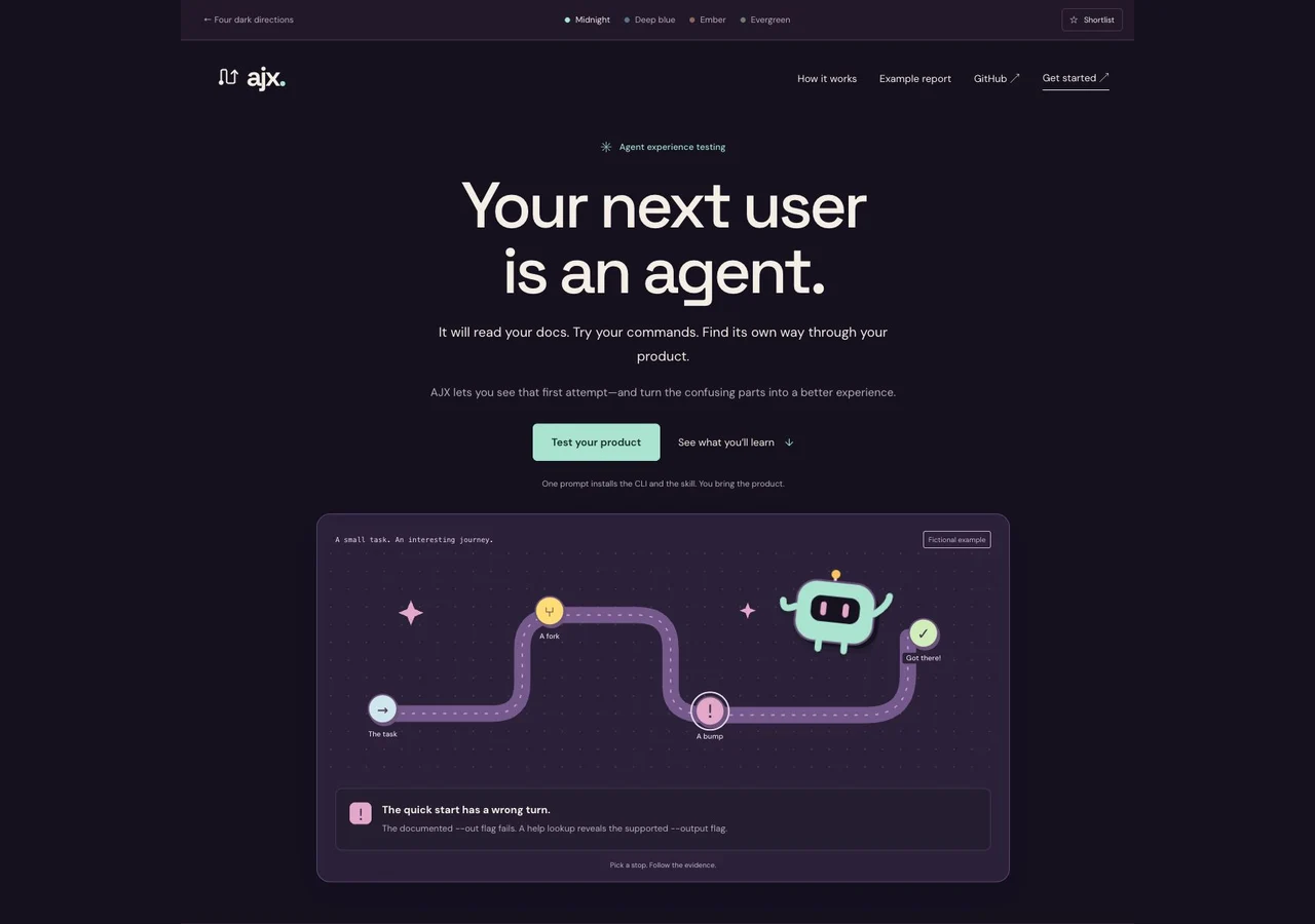
The closest relative of After hours. Plum, mint, and a wide, welcoming journey.
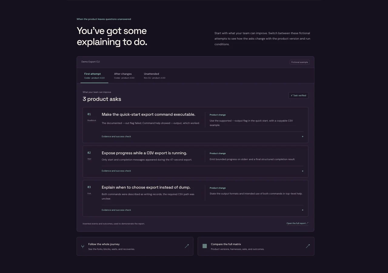
A centered introduction, a broad path, and a clear product-ask ledger.
See the report treatment ↗After hours, with a new point of view.
The headline is the starting point. Each page follows it through the product story, a real report format, and an agent-led first run.
See how the story fits together ↓
Explore Midnight ↗
The closest relative of After hours. Plum, mint, and a wide, welcoming journey.
A centered introduction, a broad path, and a clear product-ask ledger.
See the report treatment ↗
Explore Deep blue ↗
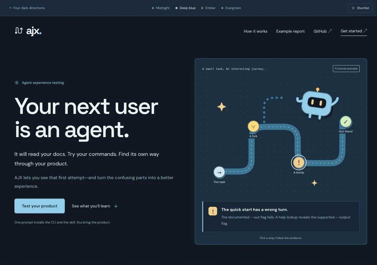
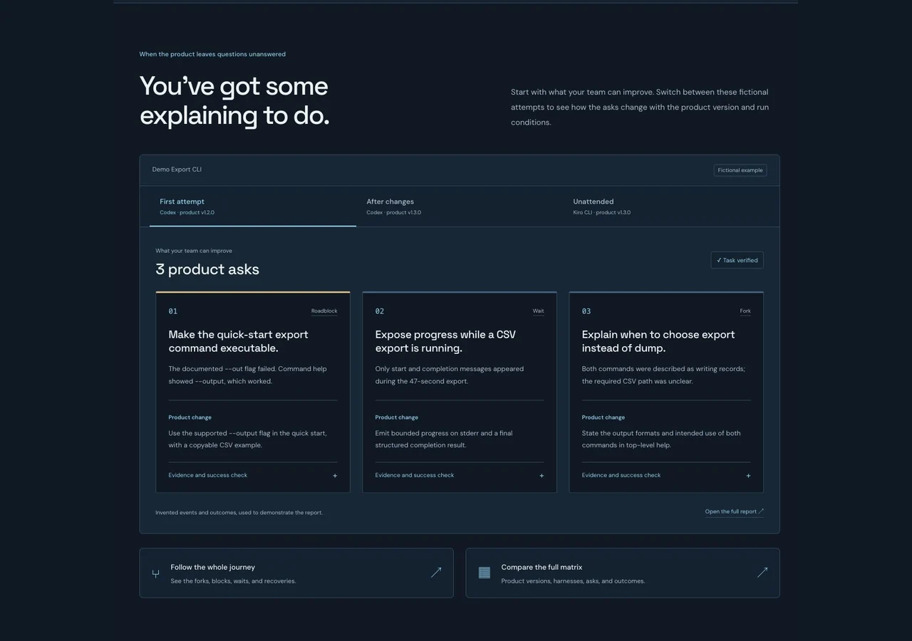
Cool, precise, and quietly technical. Ice blue signals against a deep navy canvas.
A split introduction with the journey beside it; evidence arranged for comparison.
See the report treatment ↗
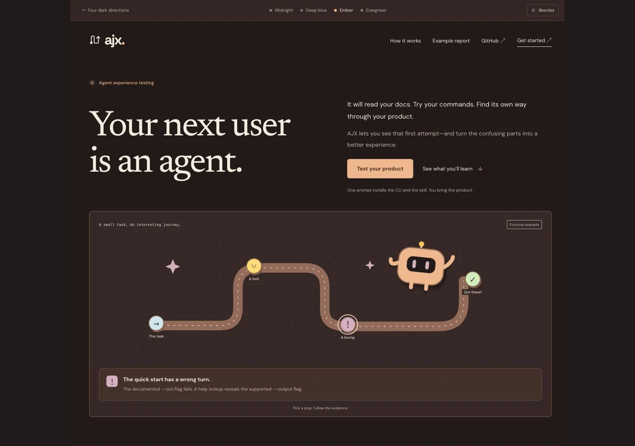
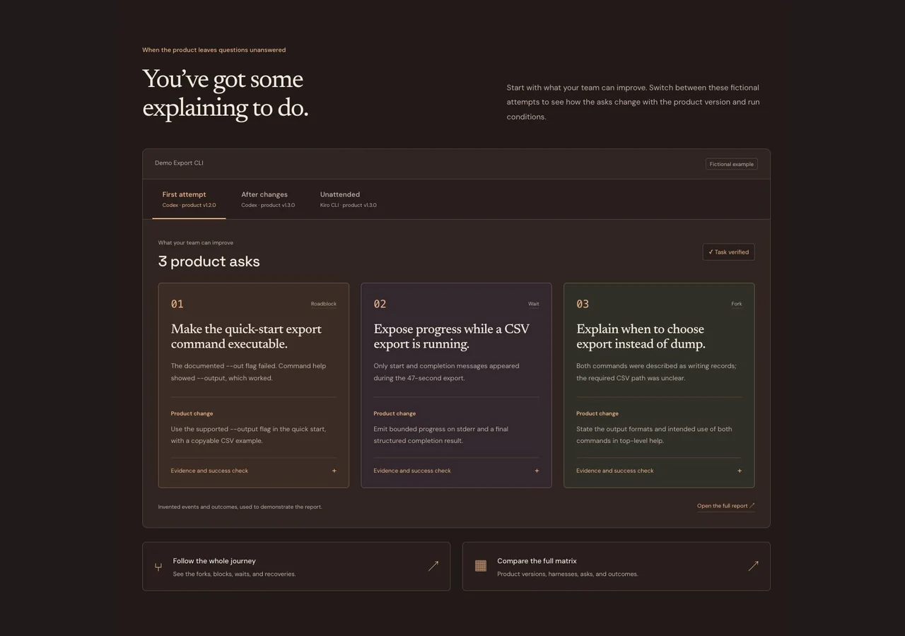
Explore Ember ↗
Warm charcoal, apricot, and a little human character. A darker page that still feels inviting.
An editorial opening, a wide path, and three tangible product asks.
See the report treatment ↗
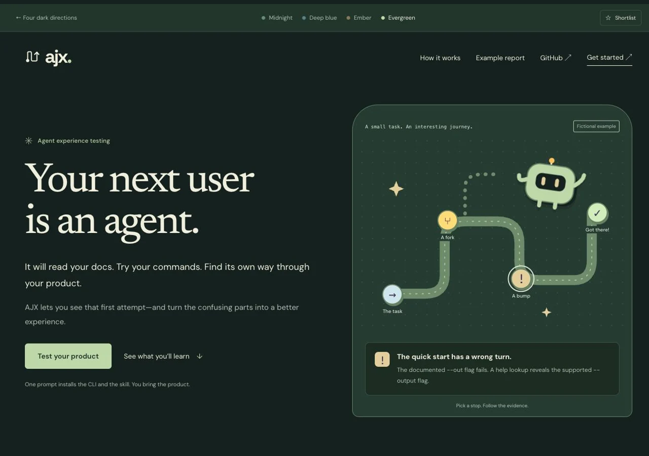
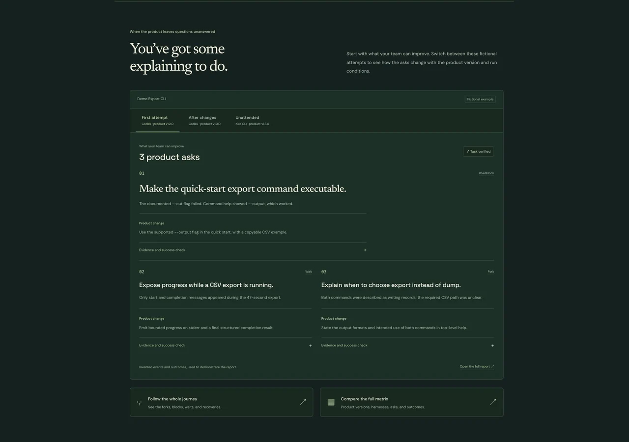
Explore Evergreen ↗
Forest green and soft parchment. The calmest, most considered direction.
A serif headline beside a night-time journey, followed by a readable field report.
See the report treatment ↗The page has a point of view.
Every design asks the same question: how does your product treat an agent meeting it for the first time?
Your next user is an agent.
Let your product speak for itself.
A little direction goes a long way.
You’ve got some explaining to do.
Make the first step feel like second nature.
A good agent experience is built on purpose.